
Bubble Rap: Visualizing Poverty Dynamics
Abstract
Animated bubble graphs can be very useful in helping one to visualize the evolution of poverty. We discuss the issues involvedin measuring global poverty, and then explain how to create these graphs in Excel, showing the links between povertyand GDP per capita for six regions of the world between 1981 and 2008. The animated graphs can provide insightsthat are difficult to gather from tables of numbers or static graphs.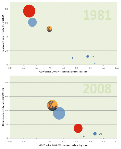
Downloads
Additional Files
Published
2014-01-14
Issue
Section
Articles
